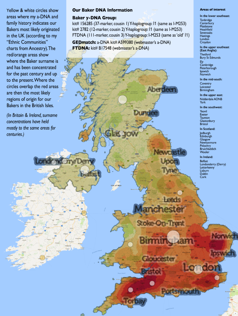
Below is an interesting map. The reddish overlay areas show the concentrations of the Baker surname from the late 1800’s to the present (from British census studies). Remember that surname distribution in Britain and Ireland has remained fairly constant for centuries. The white circles indicate where Ancestry’s “Ethnic Communities” information says our most likely areas of origin are. The circles were generated for our Bakers by what is most likely a combination of a-DNA information and our historical data on the Ancestry site. The combination of both of these overlays should give us some good ideas about where home was for our ancestors in Britain and/or Ireland around 1650 or so. Before one of them emigrated to America. Yes, we’re looking hard for that elusive fellow…
Be sure to read the text in the margins of the map. All of the DNA information our Bakers now have is in the white box at the top of this map. (Click on the map to see it at full size.) (See the map with the DNA circles only here.)
